Volume II, Book 1:
Scientific, Planning, Humanitarian, and Teaching Applications, From DevInfo to Google Earth
ANALYSIS
- GIS Analysis: a variety of strategies may be employed here. In the previous chapter, the .apr file was converted directly in ArcView3.2; it may also be imported into ArcMap. In either case, one has to be careful to include needed fields in the underlying attribute table required for projection of data to Google Earth. Similarly, analysis at the level of the GIS interface may take place either in ArcView 3.x or in ArcMap 9.x. Some samples of each are offered below as some groups may have access only to the older software. They are merely suggestive of the vast array that might be created. The indicators chosen are suggested by the UNICEF working document: Tracking Progress in Maternal, New Born & Child Survival, The 2008 Report.
- ArcView 3.x
 Maternal mortality by country: darker shades of red indicate higher rates (per 100,000 live births). The shaded circles are sized according to mortality of children under 5 years of age. The larger the radius, the higher the rate. The background of the circles is shaded transparent to let the underlying country color show through. There appears to be a strong direct association between the two indicators: countries with a high maternal mortality rate also have a high childhood mortality rate. |
 Maternal mortality by country: darker shades of red indicate higher rates (per 100,000 live births). The shaded circles are sized according to sustained access to fresh water. The larger the radius, the higher the value. The background of the circles is shaded transparent to let the underlying country color show through. There appears to be a strong inverse association between the two indicators: countries with a low maternal mortality rate have a high value for sustained access to water. |
Perhaps these observed associations are not surprising. It seems plausible to think that countries that have high mortality for one fragile group might well have high mortality for others. On the other hand, it also seems plausible that good access to fresh water may help to reduce mortality and vice-versa. Maps of this sort, are useful for demonstrating natural associations to a target population that might be otherwise unaware of them. They are often of even greater value, however, when one looks for the areas that do NOT conform to the expected situation. In this case, the coastal countries of west Africa and Burundi appear to have high maternal mortality ratios, high childhood mortality rates, and fairly high values of sustained access to fresh water. Taking a closer look at public health policy and a variety of other variables, normalizing as appropriate, that focus on these areas might be suggested. The map serves not only as a visual display of data but also as a guide to where further research and data collection might be targeted: maps and decisions interact and affect each other.
- ArcMap 9.x
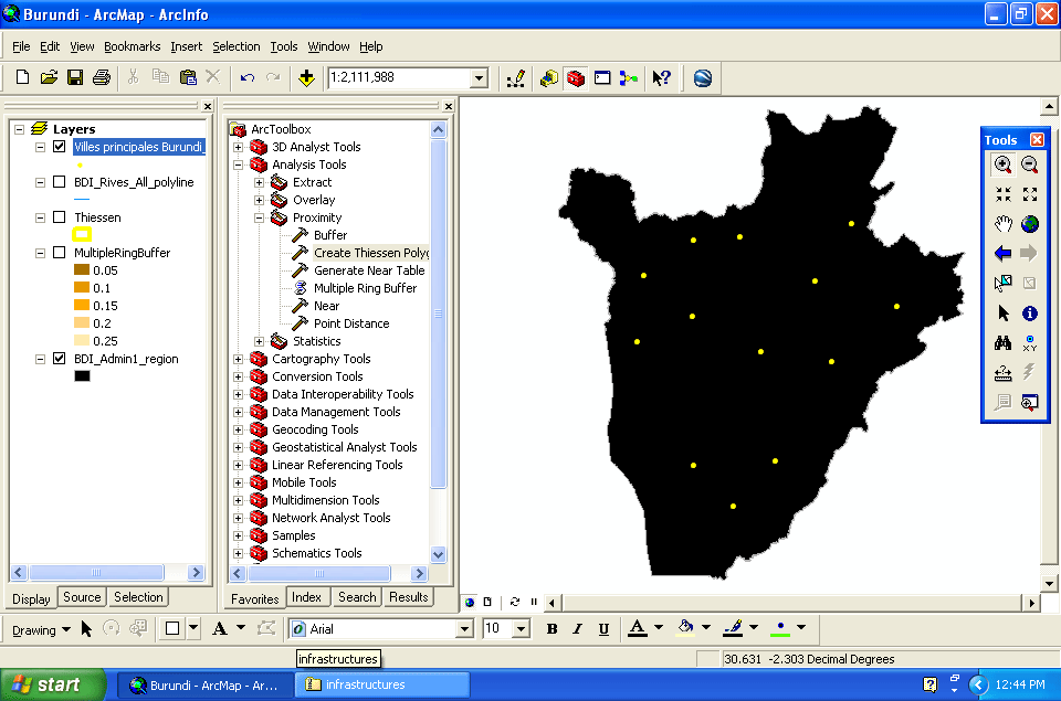
The example below singles out the country of Burundi for a closer look using ArcMap 9.x. The map incorporates a number of concepts: distance from a city; how cities share space; access to streams. The images below suggest one use of the ArcToolBox in ArcMap 9.x. Lines of the Thiessen polygons follow the intersections of the circular buffers surrounding the towns--that observation is a universal fact and is not coincidental (see, for example, the linked article with animated figures). While these maps have some uses, it is quite clear that simultaneous visualization of the complex hydrological network coupled with the buffered city map is difficult, at best.
 |
 |
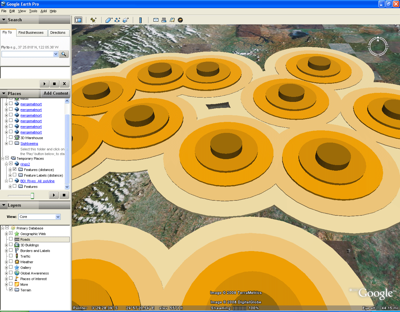
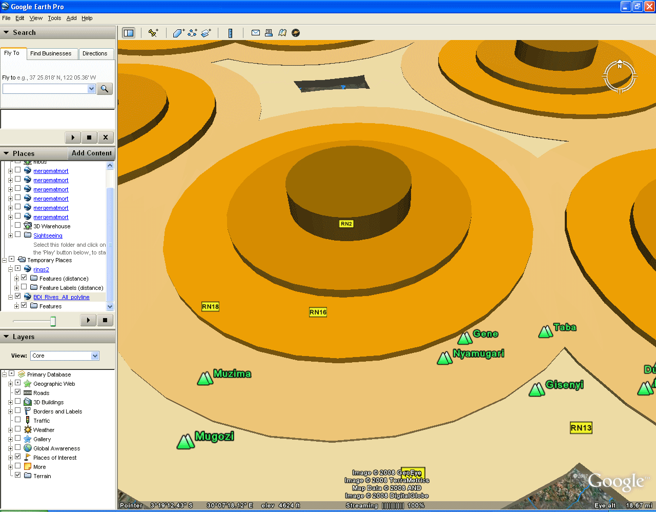
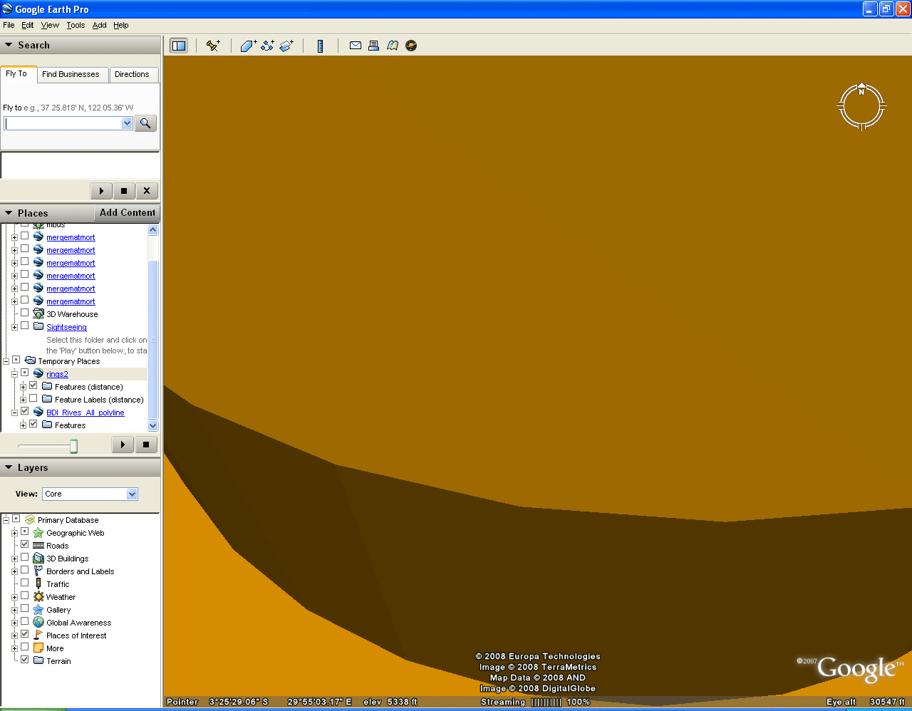
However, when the city buffers and the hydrology are taken to Google Earth, and the transparency is set at various levels, it becomes easy to visualize, simultaneously, the buffers, the hydrology, and the features, such as roads, introduced in the checkboxes in Google Earth. The rivers follow the terrain and the buffers are centered on the cities; one can see buildings by diving into the buffers once they have been made transparent. The animations below illustrate screen captures of such activity in Google Earth. The reader is, however, encouraged to download the associated .kml files using these links and open the files in Google Earth: hydrology; buffers.
 |
 |
 |
The world of GIS usage in spatial analysis is a complex one. There are many online resources available for the reader wishing to pursue various topics. The point here is simply to indicate that this richness is part of the sequence in moving from DevInfo to Google Earth and that it can be tapped in a variety of ways depending on available software and expertise.
- Google Earth Analysis. Again, the indicators chosen are suggested by the UNICEF working document: Tracking Progress in Maternal, New Born & Child Survival, The 2008 Report. GIS software offers a stunning array of opportunity for analyzing spatial information. When the mapped information is transformed to Google Earth, the visualization come to life and offers the reader a chance to drive through mapped information. As with the GIS, there are many possible ways to visualize spatial data. A few are offered here to encourage the reader to make independent and imaginative trials, as well.
- Placemarks
and Animated Tours--use the associated .kml file downloaded from the
previous chapter: One of the simplest ways to navigate a 3D
scene is to let the software fly you around it. Add some
"placemarks" to help with the navigation. In the scene below, two
yellow balloon placemarks have been added to indicate that there is "no
data" for either the Sudan or Libya. Then, going to "Tools" and
"Play Tour" will lead the reader through the file for Maternal
Mortality Ratios, country by country. The tour in this case is
quite long; you will visit each of the islands in the various large
offshore island groupings.
 |
- Automated
Timelines:
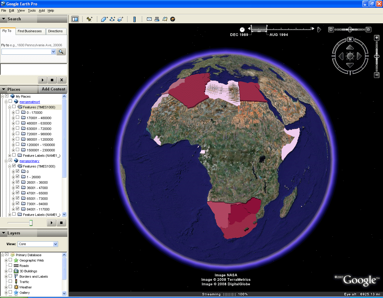
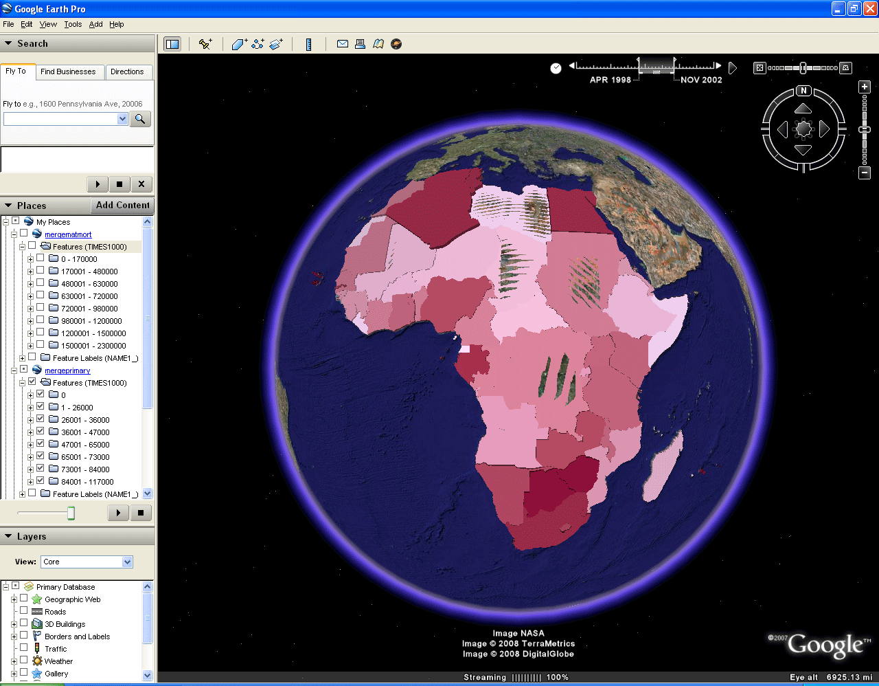
- Notice the timeline at the top right. In Google Earth, clicking on the arrow at the right end will create a display using the temporal data associated with each spatial file (entered in the Plug-in in ArcMap). In the animation of that timeline, in the top frame below, keep your eye on the timeline. You will see that as early as 1989 there is data for the Primary Completion indicator. There is none for the Maternal Mortality indicator until 1995. As the time moves forward on the timeline new countries come into the animation for the Primary Completion indicator. Then, a second indicator, Maternal Mortality, is switched on in 1995. Both indicators remain in the display until 2008 when the animation begins all over again.
- However,
it is difficult to distinguish one indicator from the other as the
animation plays out. That is because the polygons in the Maternal
Mortality indicator have much larger values than do those in the
Primary Completion indicator. In the bottom figure in the pair
below, the animation is stopped to freeze the time when the second
indicator enters the picture. Then, it is a simple matter to alternate
back and forth between the two indicators, using the check boxes on the
left, so that the reader has a visual display of the apparent inverse
relationship between Maternal Mortality and Primary
Completion--Algeria, for example, is low within the Maternal Mortality
indicator and high within the Primary Completion indicator.
This
sort of display offers yet another way to visualize different layers;
it adds the component of time. Thus, the timeline feature offers
a
powerful way to link temporal elements of spatial databases with the
globe.
. |
 |
- Custom
Color
Overlays: other ways to visualize multiple layers of data.
Now consider two layers with polygons roughly the same height (Primary
Completion and Childhood Mortality under Five Years of Age). The
color intensity gradation in the images above, for any single layer,
tells one story. The height of the extruded country polygons, for
that same layer, also tells the same story. To make color and
opacity changes, right-click on a layer name and choose "Properties"
from the menu that comes up. Experiment with the various
settings. Some suggestions are given below.
- Under
Five Indicator. One way to separate layers is to color each layer
a single color (top frame below)--blue in this case. The height
of the polygons within a layer gives information about the individual
countries even though all polygons are the same color. Tip the
display on its side to get a better view (second frame below).
Zoom in to see more clearly. Take a better look at the coastal
nations of West Africa.
 |
 |
- Primary
Completion Indicator. One way to separate layers is to color each
layer a
single color (top frame below)--red in this case. The height of
the polygons within a
layer gives information about the individual countries even though all
polygons are the same color. Tip the display on its side to get a
better view (second frame below). Zoom in to see more
clearly. Take a better look at the coastal nations of West Africa.
 |
 |
- The two indicators together. When the blue and red layers are both clicked on at the same time, red and blue strata are evident at the edge, where there is a "cut" in the surface. Otherwise, it remains difficult to visualize the two together. The blue layer dominates in most cases.
 |
One
way to solve this problem is to make the dominant color
semi-transparent--in this case, the blue layer is made 50%
transparent. Thus, red shows through the blue and gives a purple
cast
to regions of double color. Elsewhere, the higher value color
dominates. Note the Moiré effects in Southern Africa
suggesting
coplanar polygons representing similar values. Naturally, both
colors could be made of varying degrees of opaqueness. More
indicators could be added, as well. The sequence of images below
shows the merits of this
scheme. It works best when contrasting bright colors are chosen;
the larger the number of colors/layers, the more one has to pay
attention to color mixing strategy.
- Additional
resources from Google Earth: these may aid in analysis.
- Downloaded Spreadsheets:
- Google Spreadsheet Mapper enables the user to enter a large number of placemarks from an online spreadsheet. The spreadsheet will hold up to 400 entries.
- Sample image of the top part of an online spreadsheet.
 |
- Google
Earth API (Application Programming Interface):
- Embed a running window of Google Earth in a webpage
- Screen capture of such an embedding
 |
TABLE
OF CONTENTS
- INTRODUCTION: Assessment, Analysis, and Action--Community Systems Foundation Approach
- ANALYSIS:
Software
used in analysis:
- DevInfo
5.0: http://www.devinfo.org/
- Adobe® PhotoShop and ImageReady
- Adobe® DreamWeaver
- ESRI:
- ArcView® 3.2
- ArcGIS® 9.2
- ArcCatalog®
- ArcMap®
- Google Earth®
Author
affiliations:
- Arlinghaus, Sandra Lach. Adjunct Professor of Mathematical Geography and Population-Environment Dynamics, School of Natural Resources and Environment, The University of Michigan. Executive Committee Member (Secretary) Community Systems Foundation, sarhaus@umich.edu, http://www-personal.umich.edu/~sarhaus/
- Naud, Matthew. Environmental Coordinator and Assistant Emergency Manager, Systems Planning Unit, City of Ann Arbor
- Oswalt, Kris S. President, Community Systems Foundation
- Rayle, Roger. Scio Residents for Safe Water
- Lars Schumann. Manager and
Research Computer Specialist, University of Michigan 3D Laboratory at
the Duderstadt Center; also of Cornell University, Ithaca NY
- Arlinghaus, William C. Professor of Mathematics and
Computer Science, Lawrence Technological University, Southfield, MI
- Arlinghaus, William E. General Manager, Chapel Hill Memorial Gardens, Grand Rapids, MI
- Batty, Michael. Bartlett Professor of Planning and Director of the Centre for Advanced Spatial Analysis (CASA) at University College London
- Haug, Robert. Ph.D. Candidate, Middle Eastern and
North African Studies, The University of Michigan
- Larimore, Ann Evans. Professor Emerita, Residential College, The University of Michigan
- Longstreth, Karl. Head, Map Library, The
University of Michigan
- Nystuen, Gwen L. Parks Advisory Commission;
Environmental Commission;
City of Ann Arbor
- Nystuen, John D. Professor Emeritus of Geography and
Urban Planning, Taubman College of Architecture and Urban Planning, The
University of Michigan. Chief Executive Officer, Community
Systems
Foundation
Published by:
Institute of Mathematical Geography
http://www.imagenet.org
http://deepblue.lib.umich.edu/handle/2027.42/58219
August, 2008.
Copyright by Sandra Arlinghaus, all rights reserved.