Sandra Arlinghaus and Michael Batty
Dr. Sandra Arlinghaus is Adjunct Professor at The University of Michigan, Director of IMaGe, and Executive Member, Community Systems Foundation.
Dr. Michael Batty is Bartlett Professor of Planning at University College London where he directs the Centre of Advanced Spatial Analysis.
|
KML/KMZ
FILES TO DOWNLOAD:
BOTH
HAVE ANIMATED TIMELINES THAT PLAY IN GOOGLE EARTH
IN-FILL BUFFERS FOR UK DATA: HYPOTHETICAL EXPANSION OF TOWNS OVER TIME A CENTURY OF CHANGE, UK DATA: POPULATION TOTALS, CHANGE OVER TIME, BY DECADE |
INTRODUCTION
Benoit Mandelbrot has shown us the power that visualization has to play in science and in everyday life. He brought to life as beautiful fractals curves that had lain dormant in mathematical notation for decades. Both authors have a long history of using fractals in geography. As fractals helped to guide (and continue to guide) much significant research, so too, we believe will the increased visualization present in a variety of software, such as Google Earth, that permits the linkage of earth images with numerical representation in a 3D model.
In 2006 we published a pair of electronic articles that demonstrated the exiciting visualization power of Google Earth with historical United Kingdom population data. Readers could download files, load them into Google Earth, and drive around the files as they read about either 1901 data, only, for the entire United Kingdom or about greater London data, only, for the century from 1901 to 2001. They could easily visualize complex environmental dynamics in association with selected spatial and temporal extents from a demographic data set. In this article, we adopt a similar approach and extend it to the entire historical data set covering over 460 place names in the span of the century from 1901 to 2001. Again, the reader is encouraged to download .kml files to open in his/her own desktop computer loaded with the free Google Earth.
The images below show the locations of the cities and towns in the full data set in association with the total population of each on a decade by decade basis. The animated sequences of captured images link spatial and temporal data associated with population data. When the animated sequences are viewed in Google Earth a link is also forged with environmental issues, creating a population-environment dynamic that not only is useful in visualizing data but also may help in identifying interesting and important research directions.
The locations were determined by adding latitude and longitude to the set of demographic data. Each place name was entered into an online lat/long finder [ iTouch Map.com: Mobile and Desktop Map Finder -- http://itouchmap.com/latlong.html ]. The process may sound a bit tedious, but it goes quickly and accurately once an efficient copy-and-paste procedure is adopted. Following acquisition of geographic coordinates, it was then relatively straightforward to insert the data into Geographic Information System software (ArcMap 9.2 from ESRI) and manipulate it in various ways. From there, a free plug-in to ArcMap was used to convert the data to .kml format. One important point to note, though, is that manipulation of data in the GIS using features that do not directly alter the attribute table may not go through in the kml file to Google Earth. When that happens, an error message appears on attempting to load the file into Google Earth. The solution is to go back to the GIS and create the formulas in the attribute table. Add new fields to the attribute table and use the functions in the Field Calculator. Readers wishing more detail of the mechanics of using GIS software may wish to open the website of ESRI. Or, they might consider some of the related, but different, detail displayed in the linked online book.
TOTAL POPULATION DATA
Direct representation of data
To look at the entire United Kingdom city/town pattern in space, and associate it with change over time, screen captures of the .kml files were animated on a decade by decade basis with dates typed in on the screen capture layers. The result, with simple extrusion of icons, is shown in Figure 1. To help with locational focus and with tracking of complicated pattern, a label above Plymouth is included. Also, to help with tracking, a movie is included so that the reader may control animation rate.
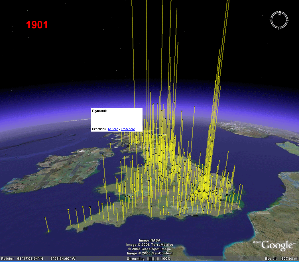 Figure 1. Inventory of United Kingdom data represented on a decade-by-decade basis. Download associated .kml files: 1901 | 1911 | 1921 | 1931 | 1941 | 1951 | 1961 | 1971 | 1981 | 1991 | 2001 | |
To take a closer look at change in spatial pattern over time, it may be helpful both to zoom in within Google Earth to the already identified Plymouth region, and also to color the icons atop the bar charts in alternating colors: yellow in decades beginning with an even numeral and red in decades beginning with an odd numeral (Figure 2). Place names associated with all icons enter in the last frame of this larger (more local) scale image. While an alternation pattern is helpful in separating data, it is not always the case that the alternation pattern is an increasing one representing increasing population as time progresses. Note, for example, the pattern in the period from 1931 to 1961 as constrasted with the later pattern. To see this pattern more clearly, with reader control over the animation rate, a linked movie is included.
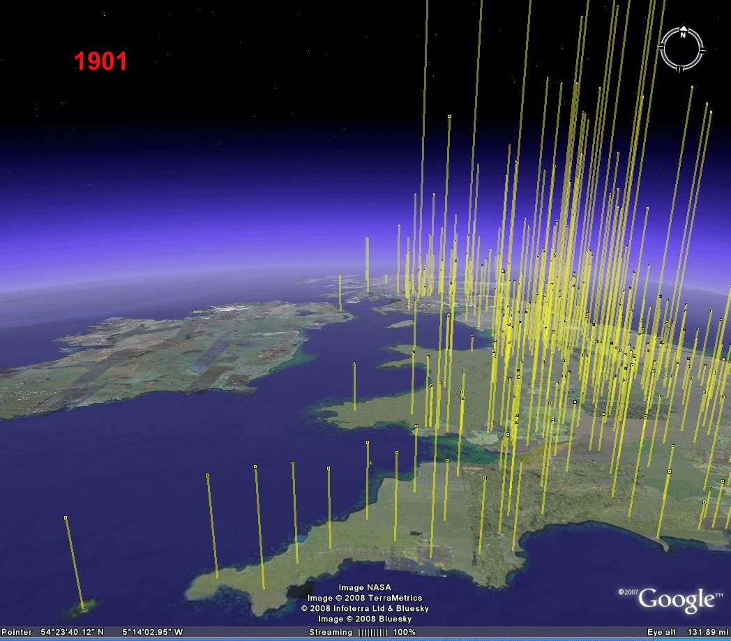 Figure 2. Inventory of United Kingdom data on a decade-by-decade basis using alternating colors to separate pattern: zoomed in on the Plymouth region. The same .kml files, with alterations made in Google Earth in icon color, produced these images as produced those in Figure 1. |
The evidence of maps shows, once again, that the period from 1931 to 1961 (World War II and the immediate postwar era) has fluctuating data while the post 1961 period shows a steady increase in population on a decade by decade basis. It is straightforward in Google Earth to click layers on or off as desired. Figure 3 shows the result of limiting the animation in Figure 2 to the period from 1931 to 1961. This sort of visualization offers a broad context in which to view population changes over time. The reader may broaden or limit the view to a greater or lesser extent by downloading associated .kml files and making simple alterations in Google Earth.
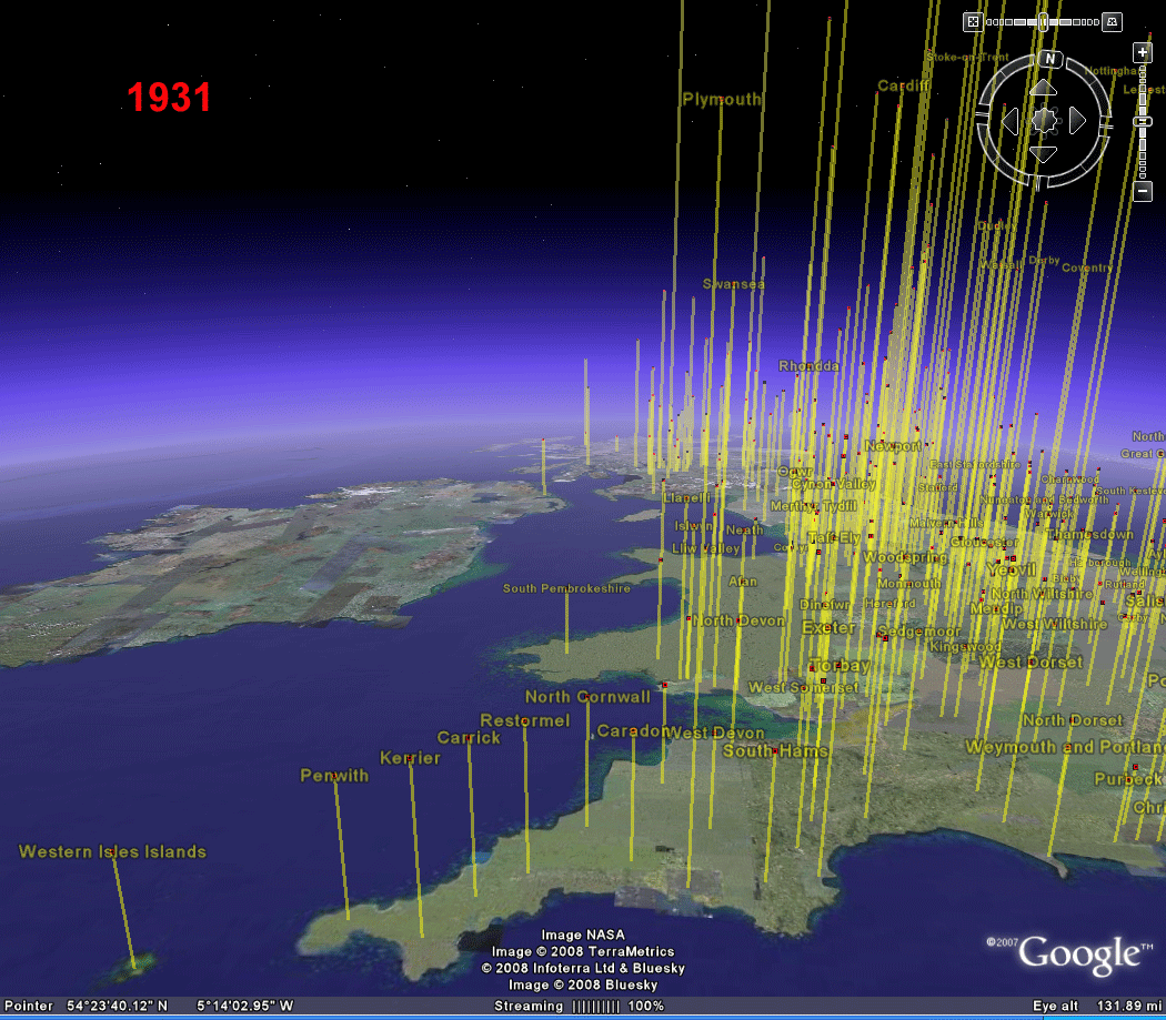 Figure 3. World War II and population patterns in the Plymouth region. The same .kml files, with alterations made in Google Earth in icon color, produced these images as produced those in Figure 1. |
In Figure 3, adjacent decades were selected for a separate animation because the data from those decades fluctuated in a pattern that was unexpected (but not perhaps when one factors in World War II). It is not necessary to limit the view to adjacent decades (the finest temporal division within the data set). Figure 4 shows change in population over the entire century of data--beginning and end. In this figure, the 1901 data and labels are colored yellow; the 2001 data and labels are colored red. All are made 50% transparent so that common values are orange and extension beyond the common value is either red or yellow. Thus, one sees at a glance that both Western Isles Islands and Penwith lost population over the century (both from line color and from relative red/yellow label position) while most others in the region gained population. The effect of World War II is largely masked at this temporal scale.
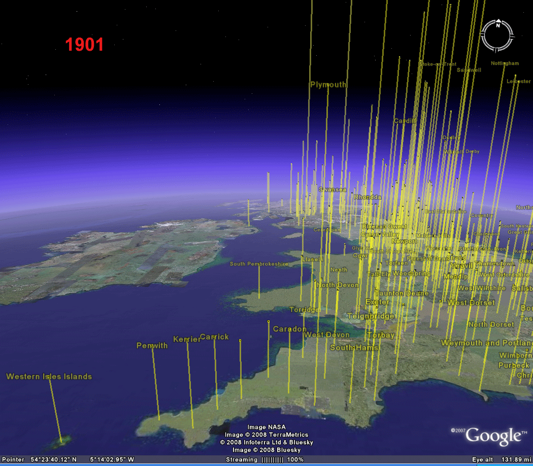 Figure 4. A century of United Kingdom data in Google Earth. The same .kml files, with alterations made in Google Earth in icon and line color, produced these images as produced those in Figure 1. |
Buffered representation of data
The sequences of images below consider the data entries as more than the cities and towns represented as geographic points. In them the points are buffered to suggest local urban areas. The buffers calculated around the geographic coordinates for each city are spaced at 5000, 10,000, and 15,000 feet. The heights of the buffers are simply calculated as the reciprocal of the distance times a constant multiplier: 3000 for the first buffer, 2000, for the next, and 1000 for the exterior. These constants were chosen for visual appeal. Arbitrary constants, generally, were chosen so that no data specific to any particular year of data was selected: the choice cuts generally across the data. When the buffers are made semi-transparent, it becomes possible to see, simultaneously, the buffers and the underlying terrain.
Figure 5 below shows a sequence of three images. Each shows the range of coverage of the data and portrays location with a set of rods of identical height, extruded from buffers calculated in the GIS. Thus, all yellow rods are the same height and are tall and thin in comparison with others; tan rods are of medium height and width; burnt sienna rods are the shortest and broadest. In Figure 6, the rods are combined to give a multiple buffer effect.
 Figure 5. Yellow rods are slender and tall; tan rods are of medium breadth and height; burnt sienna rods are short and widest. |
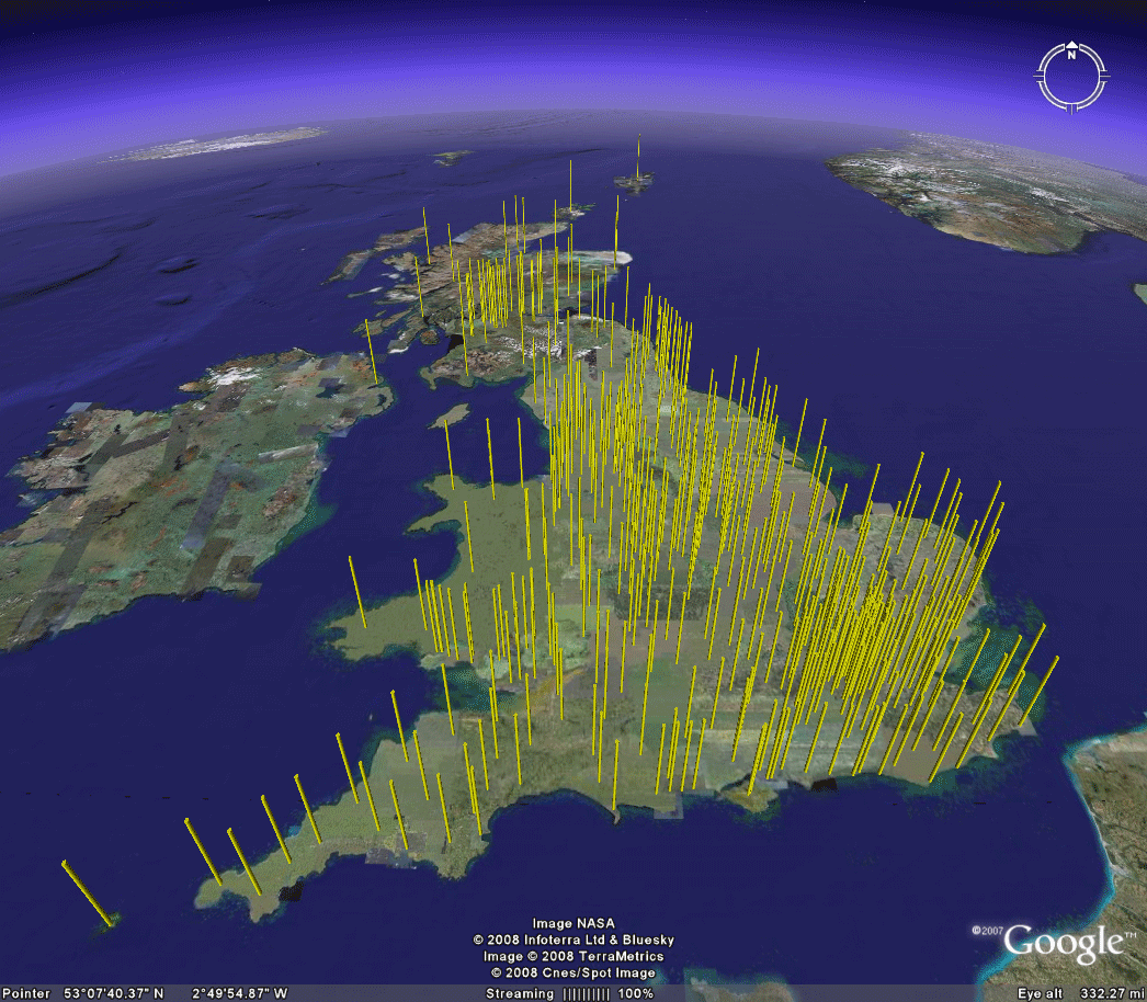 Figure 6. All three rod styples (extruded GIS buffers) are combined. |
| Download associated .kml files to make all the images in these figures (and more): Buffer 1, Buffer 2, Buffer 3. |
The interactive character of these 3D models permits the reader to overcome a certain amount of clutter by changing scale and by changing levels of opacity of the graphics derived from the data set. Several examples are shown below in Figures 7 and 8. One can choose, in the GIS, to calculate multiple buffers simultaneously. When such a configuration is exported to a .kml file, and loaded into Google Earth, one can only set the level of transparency to the same level for all buffers. When buffers are calculated individually however, and exported as separate .kml files, then the user retains control over setting variable levels of transparency for individual elements in the buffer set. Thus, in the example below, the central yellow buffers are more opaque than is the exterior buffer so that the yellow shows through the darker brownish shades.
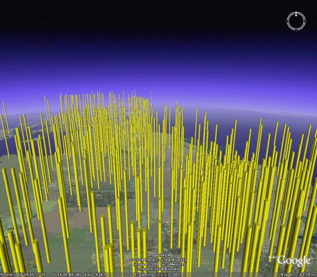 Figure 7. A closer look at multiple ring buffers. The files, Buffer 1, Buffer 2, and Buffer 3, from above contains all the material for these and more images. |
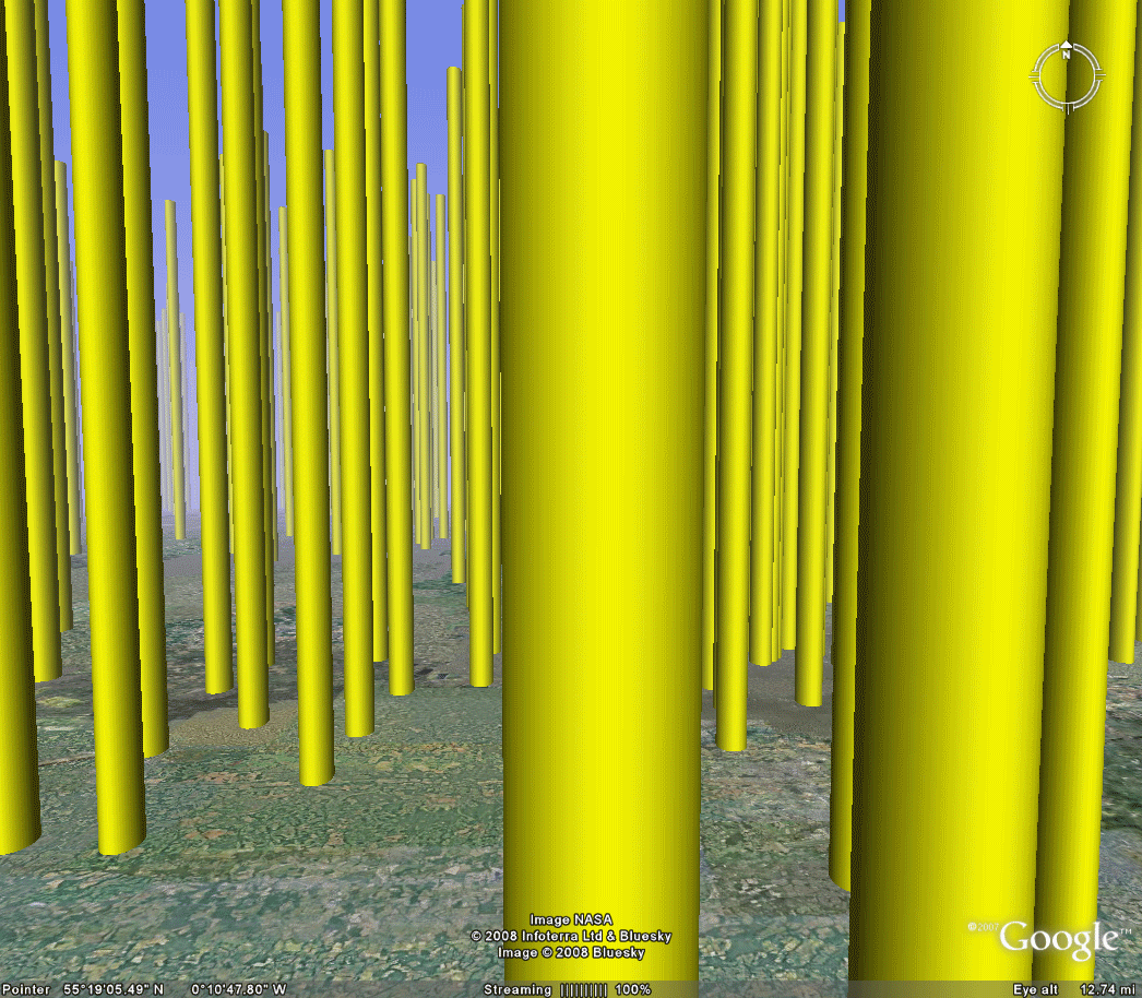 Figure 8. Changing the level of transparency affords a closer simultaneous view of buffers and terrain. The files, Buffer 1, Buffer 2, and Buffer 3, from above contains all the material for these and more images. |
Thus, one imagines driving around the UK country side, through city rings loaded, perhaps with pollution or other environmental data. Once this sort of technique for visualization becomes yet another tool for forging space/time and population/environment, the research application horizon appears unlimited!
NORMALIZED POPULATION DATA
The bar chart representation of town data works well for the total population data in the set. These vertical 3D building analogues, representing data instead of actual buildings, portray growth and decline over time. Total values are good ways to look at amounts and at certain types of change. They are not good for looking a percentage change and various forms of relative change in relation to the whole. To look at those, one must normalize the population in some way.
The GIS offers ways to normalize data. Unfortunately, when these are applied outside the attribute table, the changes are not reflected when converted to .kml and then displayed in Google Earth. To force the desired effect, one must make such calculations directly in the attribute table. Symbols are ranged in ArcMap 9.2 and then sent to Google Earth. The total population for each city is divided by the total population for the UK in the year and consideration and then multiplied by 1000. The symbols are then set to ranges using the Jenks algorithm in as many ranges as the algorithm will recognize. Smaller, lighter symbols have lower values; darker, larger symbols have higher values. The .kml file sent to Google Earth is a flat map with all symbols the same size but correctly colored as in the GIS. It is a simple matter to enter the ranged sizes in Google Earth. The flat maps brought into Google Earth offer a nice, and perhaps more conventional, view of the data, as well. Download the .kml files and associate terrain with the normalized population data. Figure 9 shows the content of these maps in animated form. Download the associated movie to control the animation rate. With the normalized data, there is remarkably little variation over time.
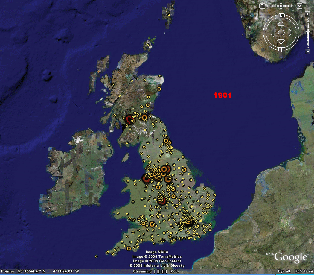 Figure 9. Normalized data, population of cities and towns in the United Kingdom, by decade, 1901-2001. Download associated kml files: 1901 | 1911 | 1921 | 1931 | 1941 | 1951 | 1961 | 1971 | 1981 | 1991 | 2001 | |
Once the files are loaded into Google Earth, then one can use the wide variety of tools already available. Figure 10, for example, shows a close-up of southern Scotland, as a study in contrast. Imagine the difficulty of the search and rescue efforts following the Locherbie air disaster, December 21, 1988, just 20 years ago today (on the publication of this issue of Solstice). The image sequence below lets us do more than merely imagine.
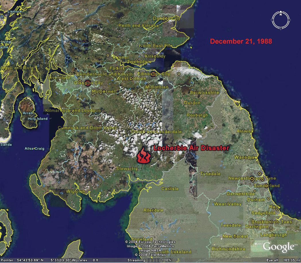 Figure 10. December
21, 1988.
In memory of those who died 20 years ago today. Mozart, Requiem (Lacrimosa) (Launch linked music in a separate tab or window to keep reading while listening.) |
REFERENCES:
- Arlinghaus, Sandra and Batty, Michael. Visualizing Rank and Size of Cities and Towns. Solstice: An Electronic Journal of Geography and Mathematics, Volume XVII, Number 2, December 2006.
- Mandelbrot, Benoit. The Fractal Geometry of Nature. New York: W. H. Freeman, 1982.
- Others inline or
archived in Deep Blue.
Solstice: An Electronic Journal
of Geography and
Mathematics,
Institute of Mathematical Geography, Ann Arbor, Michigan.
Volume XIX, Number 2.
http://www.InstituteOfMathematicalGeography.org/
Persistent URL: http://deepblue.lib.umich.edu/handle/2027.42/58219
Volume XIX, Number 2.
http://www.InstituteOfMathematicalGeography.org/
Persistent URL: http://deepblue.lib.umich.edu/handle/2027.42/58219