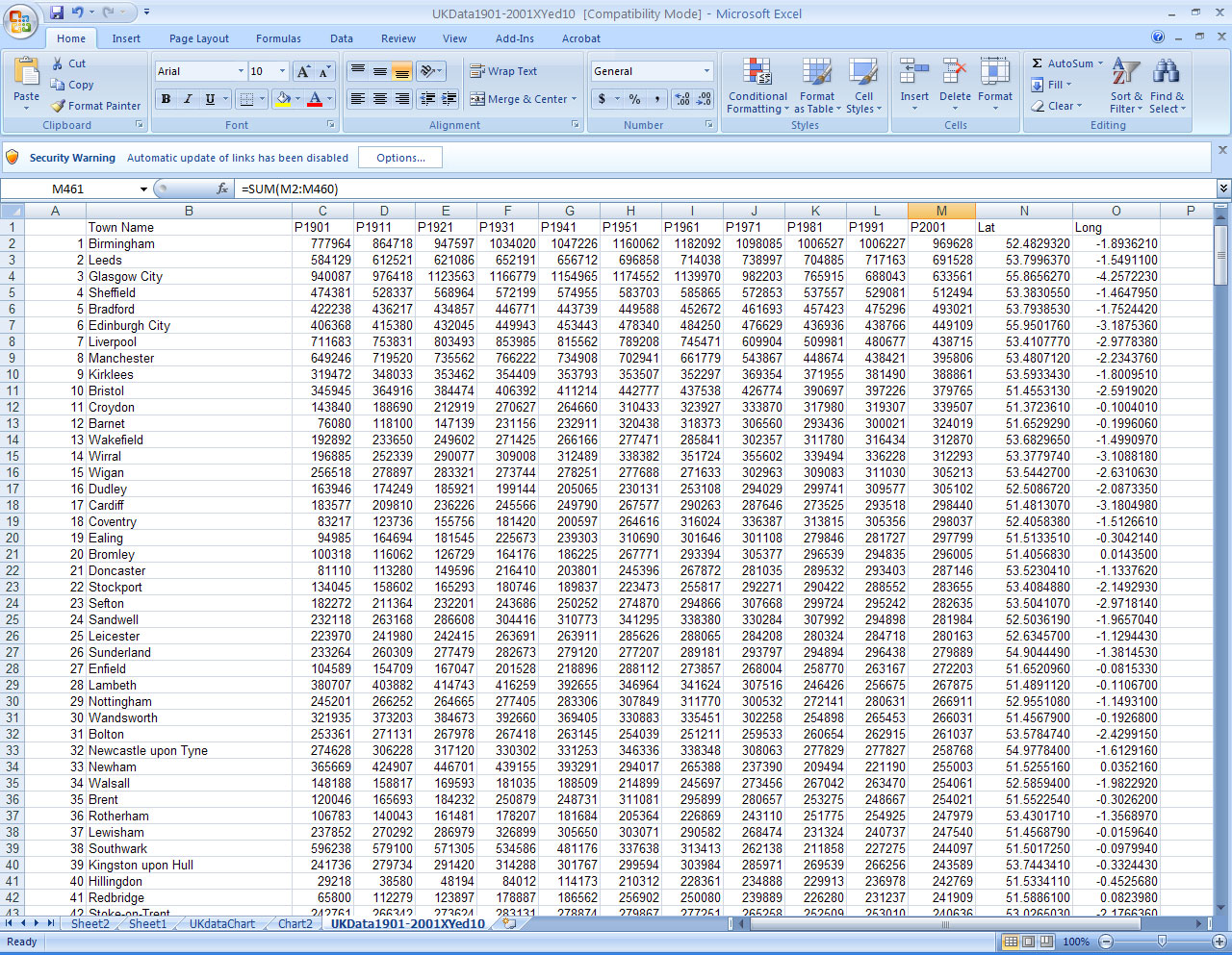
 Figure 1a. A sample of UK historical urban data sets, ordered from high to low on the column for 2001 total population data. |
| Figure
1c.
London data, 1901 to 2001, portrayed in Google Earth. |
Figure 1a. A sample of UK historical urban data sets, ordered from high to low on the column for 2001 total population data. |
| Figure
1c.
London data, 1901 to 2001, portrayed in Google Earth. |
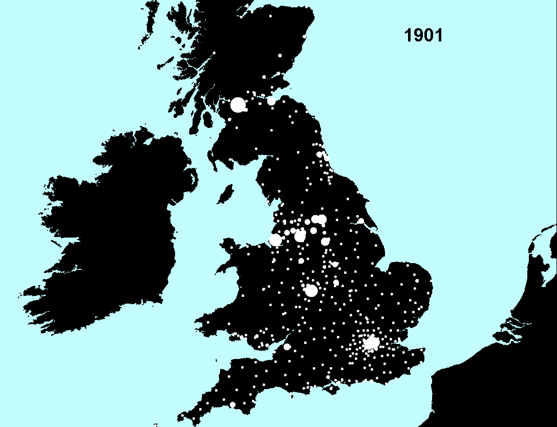 Figure 2. Data sets of Figure 1a mapped using 10 equal intervals of 45 or 46 to separate the 458 entries into classes represented by varying circle size. Circle colors alternate from white to red by decade. Thus, the emphasis is on tracking decline from one decade value to the next. |
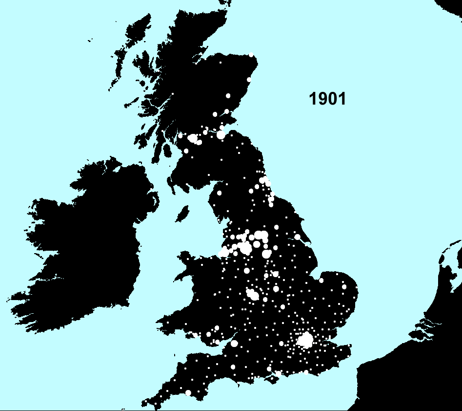 Figure 3. Data sets from Figure 1a mapped ranging the data by standard deviations. Smallest circles represent values farthest below the decade-value mean; largest circles represent values farthest above the decade-value mean. |
 Figure
4.
Focus on Glasgow, Scotland. Notice the decline
in city circle
size as time progresses.
|
 Figure 5a. Some central cities within the conurbation are larger in 1931 (red) than in 1941 (white). Does decline at the center result from movement of population outward (or elsewhere) or from larger than usual number of deaths (due to war)? |
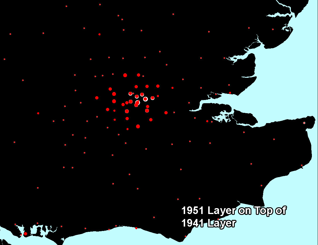 Figure 6a. As in Figure 5a, decline at the center. Some values from 1941 (white) are larger than corresponding ones from 1951 (red). |
 Figure 7a. Shrinkage of towns near the center. Some 1951 (red) towns are larger than their corresponding 1961 (white) counterparts. |
 Figure 8a. Shrinkage of towns near the center. Some 1961 (white) towns are larger than their corresponding 1971 (red) counterparts. |
 Figure 9a. Shrinkage of towns near the center. Some 1971 (red) towns are larger than their corresponding 1981 (white) counterparts. |
 Figure 10a. Shrinkage at the center is no longer evident. All 1991 (red) towns appear to be at least as large as their corresponding 1981 (white) counterparts. |
 Figure 11a. Shrinkage at the center is no longer evident. All 2001 (white) towns appear to be at least as large as their corresponding 1991 (red) counterparts. |
 Figure 5b. Some edge-cities within the conurbation are larger in 1941 than in 1931. Coupled with Figure 5a, this pattern might represent the beginning of sprawl. |
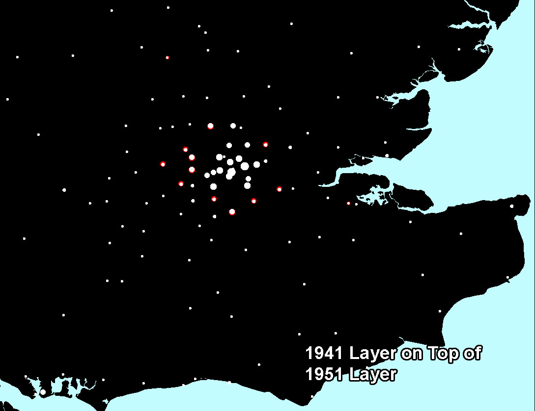 Figure 6b. As in Figure 5b, growth of towns away from the center. Some 1951 towns (red) are larger than 1941 (white) towns. More evidence of outward movement. |
 Figure 7b. More enlargement of towns near the periphery. Some 1961 towns (white) are larger than their corresponding 1951 (red) counterparts. |
 Figure 8b. More enlargement of towns near the periphery. Some 1971 towns (red) are larger than their corresponding 1961 (white) counterparts. |
 Figure 9b. More enlargement of towns near the periphery. Some 1981 towns (white) are larger than their corresponding 1971 (red) counterparts. |
 Figure 10b. More enlargement of towns near the periphery. Some 1991 towns (red) are larger than their corresponding 1981 (white) counterparts. |
 Figure 11b. More enlargement of towns near the periphery. Some 2001 towns (white) are larger than their corresponding 1991 (red) counterparts. Notice one town near the center that is growing in 2001. Does this observation, coupled with Figures 10a, and 11a, suggest a reversal of trend? Are people moving back to the central areas? |
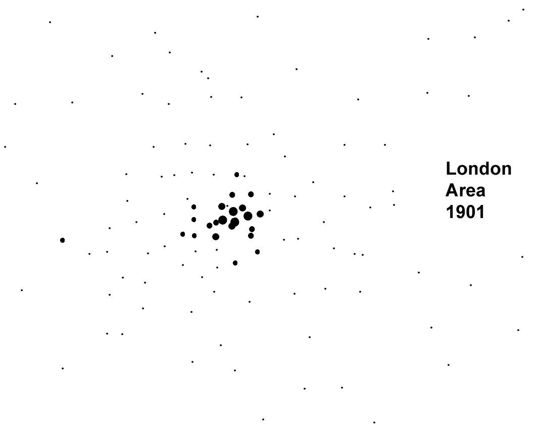 Figure 12a. London area towns; mapped ranges based on standard deviation partitions. Maps are prepared in true black and white .tif format suitable for use in the free Fractalyse software. |
||||||||||||||||||||||||||||||||||||
|
||||||||||||||||||||||||||||||||||||
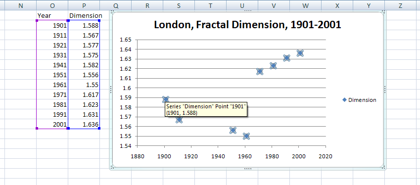 Figure
12c.
Graph of data in Figure 12b. Once again, from
yet another vantage point, the decade between 1961
and 1971 is one of
great change. Observe, as well, the low values
in the World War
II decades following earlier stability. The
animation is similar
in nature to one in an earlier article [Arlinghaus,
Batty, and Nystuen,
2003].
|
| Solstice:
An
Electronic Journal of Geography and Mathematics, Volume XXI, Number 2 Institute of Mathematical Geography (IMaGe). All rights reserved worldwide, by IMaGe and by the authors. Please contact an appropriate party concerning citation of this article: sarhaus@umich.edu http://www.imagenet.org http://deepblue.lib.umich.edu/handle/2027.42/58219  |
 IMaGe logo designed by Allen K. Philbrick from an original provided by the Founder. |
|
Congratulations to all Solstice contributors. |
|
| Remembering
those who
are gone now but who contributed in various ways to Solstice or
to IMaGe
projects, directly or indirectly, during the first 25
years of IMaGe: Allen K. Philbrick | Donald F. Lach | Frank Harary | William D. Drake | H. S. M. Coxeter | Saunders Mac Lane | Chauncy D. Harris | Norton S. Ginsburg | Sylvia L. Thrupp | Arthur L. Loeb | George Kish | |