Sandra Lach Arlinghaus
| Download
Google
Earth |
| Download
kmz files to open in Google Earth: Chapter 1, Chapter 2, Chapter 3, Chapter 6, Chapter 8. |
This set of essays was originally published in 1986. There are 10 essays, each with text, images, and some with maps. Many of the essays involve mathematical notation and may appear complex. Visualization of these materials is limited. What is missing is visualization that displays color, 3D, and interactive imagery. That lack is not a weakness of the work; it is rather a sign of the times. Maps were static; production costs of maps prohibited the use of large numbers of maps. Color production was costly. Portrayal of materials on a globe, in a dynamic fashion, was unheard of. Today, all of those lacks are easily addressed. It is important to address them and bring fine scholarly documents into the contemporary realm where they might continue to stimulate others for years to come. The spatial component, and its visualization, is critical to persistence of geographical information.
The visual material below suggests one way to update these Essays by the easy introduction of a substantial spatial component. Each Essay, considered as a Chapter in the book, is treated separately. In some cases, many of the original visual materials are recast in current technology. In others, where simple line drawings suffice, fewer are done. In three cases, simple line figures seemed sufficient, alone. Generally speaking,
- The
animations are made from screen captures of
material.
- Links
to individual frames, and to movies, are provided for
readers wishing a
closer view and control over individual animation
frames.
- The
reader who is truly serious about augmenting the text
with
optimal visualization capability should download
associated files and
view them in Google Earth.
In this Essay, a theorem is proved (using concepts from projective geometry) linking harmonic conjugacy to perspective map projection. It is called the Harmonic Map Projection Theorem, and what it draws up and shows is that
- centers of projection that are inverses in relation to the poles of a sphere are harmonic conjugates in the projection plane in relation to the projected images of the poles of the sphere.
- as
a
special case of the observation above, it follows that
gnomonic and
orthographic projections, with inverse centers of
projection in the
sphere, are composed of points that are harmonic
conjugates of each
other in the plane [Arlinghaus, 1986].
- on
harmonic
conjugacy construction, Figure 1.1a, 1.1b, 1.1c.
- on
perspective
map projection construction, Figure 1.2a, 1.2b.
- on
merging
harmonic conjugacy and perspective map projection
(Harmonic Map
Projection Theorem), Figure 1.3a, 1.3b.
- on
a wish for future development, Figure 1.4.
Harmonic Conjugacy Construction
 Figure 1.1a. A and A' are harmonic conjugates. Construction after Coxeter. |
 Figure 1.1b. C and C' are harmonic conjugates. |
 Figure 1.1c. C and C' are harmonic conjugates. |
Perspective Map Projection Construction
 Figure 1.2a. Illustration showing method of projecting sphere to tangent plane using a variety of projection centers. |
 |
Merging Harmonic Conjugacy and Perspective Map Projection Constructions: Harmonic Map Projection Theorem
 Figure 1.3a. Harmonic Map Projection Theorem. Gnomonic and orthographic projections of a point P on the sphere, into a tangent plane, are harmonic conjugates with respect to the point of tangency of sphere and plane, S, and the corresponding stereographic projection of P into the same tangent plane. |
 Figure 1.3b. Animation displaying content of Harmonic Map Projection Theorem. Some of the animation sequencing needs improvement for clarity of exposition of Theorem content: Join B to the north pole (reverse Stereographic projection) to locate P on the sphere--then C and C' emerge (respectively) as harmonic conjugates of gnomonic and orthographic projection. Animation change is made in Figure 4, below. First, the harmonic construction is shown in the plane of tangency; then perspective projection, involving P, is merged with it. |
A Wish for Future Development
 Figure 1.4. The animation on the right shows the animation from Figure 1.3b with improved animation sequencing. It is an easy matter to display the animated .gif side by side with the interactive Google Earth globe. The "wish," however, is to be able to execute animated .gif style of construction directly in Google Earth (not currently possible). Were the "wish" to come true, then one might imagine that maps could be drawn in the tangent plane, showing directly how Mexico, for example, appears under orthographic projection and as the harmonic conjugate of a gnomonic projection of Mexico. The reality of maps and images could once again bring the mathematics to life! Link to movie |
CHAPTER 2: ANTIPODAL GRAPHS
Satellite navigation systems often employ satellite locations that provide highly symmetric tesselations of their orbital spheres [Laurila, 1976, 1983; Wenninger, 1979]. Evenness in satellite spacing, suggested by engineering demands, may produce as an upper bound for the number of satellites visible to an earth-based observer, half the number of the total in the entire configuration. Thus, when the satellites appear in antipodal pairs, so that as one satellite descends beyond the horizon another ascends, a flat geographical map that conforms to the earth-based observer's view of the satellite sphere, and that represents simultaneously the entire satellite configuration, would appear with antipodal points identified (abstractly glued together), as an "antipodal graph" of the satellite system.
Visualizing the antipodal graph is straightforward in the plane. Figure 2.1 shows such images in the right-hand column. What is more difficult to visualize, however, is the solid embedded in a sphere and the projection of that solid to the plane, as a Schlegel diagram (which ultimately is what makes it easy to visualize the antipodal graph in the plane). The left-hand column in Figure 2.1 offers very approximate line drawings of solids while the central column portrays the Schlegel diagram of each.
 Figure 2.1. Line drawings from the original Monograph. |
It is not too difficult, using Google Earth, to visualize the four polyhedra as embedded in a sphere with polyhedral edges as arcs on the sphere. When transparency is inserted in place of the Earth skin, then the corresponding Schlegel diagram emerges easily. Thus,
- Figure 2.1 shows how to make the Google Globe transparent.
- Figure 2.2 shows the cube in the transparent globe and illustrates derivation of the corresponding Schlegel diagram.
- Figure 2.3 shows the octahedron in the transparent globe and illustrates derivation of the corresponding Schlegel diagram.
- Figure 2.4 shows the dodecahedron in the transparent globe and illustrates derivation of the corresponding Schlegel diagram.
- Figure
2.5 shows the icosahedron in the transparent globe and
illustrates
derivation of the corresponding Schlegel diagram.
The Transparent Globe
In this essay, as in the supplement to IMaGe Monograph #1, the skin is removed from Google Earth so that the globe becomes fully or partially transparent, depending on its orientation. Here, it will be used only as a fully transparent globe; in the Monograph #1 supplement, the eclipse-effect that hides lines that are sometimes apparent was studied. In the figures below, the polyhedra are oriented so as to avoid that effect although the reader who manipulates the .kmz files, from which these images were derived, will discover that eclipse effect.
|
Figure 2.2. Process of removing the Earth skin to reveal a transparent globe. |
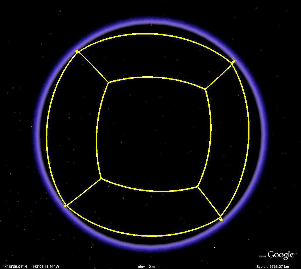 Figure 2.3a. Different views of a cube embedded in a sphere. |
 Figure 2.3b. Schlegel diagram of the cube. |
 Figure 2.3c. All vertices are labelled with large marker pins; however, the large ones for 1, 2, 3, and 4 are not visible through the globe, even though the edges of the cube are visible. Thus, to get a screen capture of a Schlegel diagram associated with the cube, insert an extra four pins (smaller) visible from the "front" view. In this animation, note that as the globe moves, the large marker pins come into view. Those added simply to create the Schlegel diagram from one perspective do not stay attached as the cube moves on the sphere. This sort of "flattening" effect of the notation is what brings the Schlegel diagram to life. |
The Octahedron Embedded in a Sphere and its Associated Schlegel Diagram
 Figure 2.4a. Different views of an octahedron embedded in a sphere. |
 Figure 2.4b. Schlegel diagram of the octahedron. Issues associated with larger and smaller marker pins are similar to those described in Figure 2.3c and are clear when navigating in the .kmz file. |
The Dodecahedron Embedded in a Sphere and its Associated Schlegel Diagram
 Figure 2.5a. Different views of a dodecahedron embedded in a sphere. |
 Figure 2.5b. Schlegel diagram of the dodecahedron. Issues associated with larger and smaller marker pins are similar to those described in Figure 2.3c and are clear when navigating in the .kmz file. |
The Icosahedron Embedded in a Sphere and its Associated Schlegel Diagram
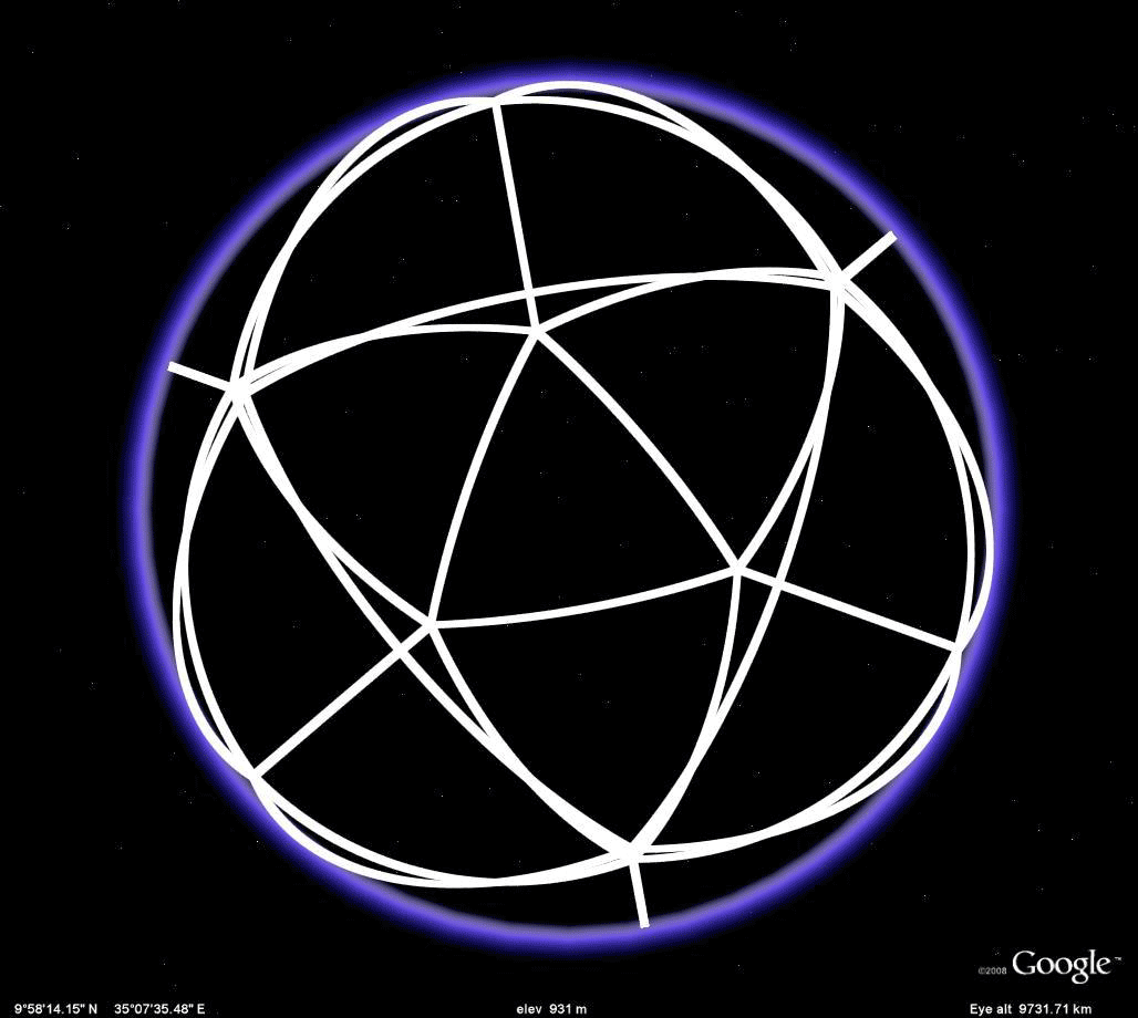 Figure 2.6a. Different views of an icosahedron embedded in a sphere. |
 Figure 2.6b. Schlegel diagram of the icosahedron. A vantage point for viewing this configuration was chosen so that all vertices would show. Issues associated with larger and smaller marker pins are similar to those described in Figure 2.3c and are clear when navigating in the .kmz file. |
The reader wishing to see other interactive views of graph theory and geography might look elsewhere in Solstice or might read the work of Arlinghaus, Arlinghaus, and Harary (2002).
CHAPTER 3: MEASURING THE VERTICAL CITY
In this essay, the idea of planning using "volume" in addition to parcels, is explored. Analysis of hypothetical parcel maps, and their extrusions, is executed using matrix algebra in order to quantify a 3D "view" of the city. Google SketchUp and other 3D modeling software offers contemporary ways to capture a volumetric approach to planning in relation to possible volume standards and elements of code. Here, the concept is to have a terraced approach so that tall buildings are set back and do not loom large over streets and pedestrian corridors. Other planning approaches of course might be adopted but those do not alter the conceptual approaches advanced here nor do they alter the appropriateness of using 3D models to capture spatial elements of urban planning.
 Figure 3.1. Hypothetical parcel map, below, and suggestion of how to visualize it in 3D, above. |
 Figure 3.2. A more contemporary approach to visualizing a hypothetical parcel map (more complex than the one in Figure 3.1) together with associated terraced volumes of possible building masses offers added analysis opportunity, particularly when coupled with other conceptual material, such as the matrix algebra characterizations of vertical parcel occupation by buildings. Viewshed calculations and related concepts come about from such considerations. |
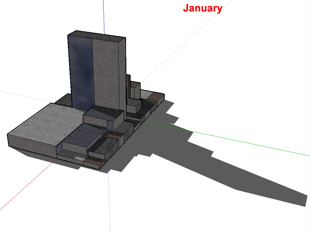 Figure 3.3. Google SketchUp offers the opportunity to study shadow patterns, as well. Here, screen captures of shadows from the hypothetical block dance across the screen, in a labelled animation, in each of the 12 months of the year. Watch the shadows on the ground and also on the other buildings. The time of day is about 1:00p.m. Latitude is not given. |
CHAPTER 4: CONCAVITY AND HUMAN SETTLEMENT PATTERNS
The shape of the northern coastline of Australia has been generalized, by biologist Joseph Birdsell, as two concave-down lobes of land separated by a concave-up lobe of water (Gulf of Carpentaria) [Birdsell, 1950]. Through this geometric observation, and through a study of the hunting and gathering practices of early migrants, he argued that a strong sense of territoriality would force migrants toward the interior, away from points of entry on the coast, and that coastline shape would force concentration of migrant settlement under concave-down northern coastline segments and dispersal of migrant settlement under concave-up northern coastline segments (Figure 4.1). One speculation derived from these geometric observations is that greater genetic diversity would occur in settlements located under concave-down northern coastline segments than would occur in settlements located under concave-up northern coastline segments.
 Figure 4.1. The concave down region concentrates flows; the concave up portion disperses flows. |
While the geometry of this idea is clear from simple line drawings such as those in Figure 4.1, it is not at all clear what the physical context of the region is like or was like. Aerial images of terrain are useful for that purpose; until recently, however, it was difficult to have ready access to aerials of remote regions of the world. A screen shot from Google Earth quickly fills that gap (Figure 4.2a). Often, roads are an indicator of population concentrations; in this case, however, the data are sparse and the pattern in Figure 4.2b suggests little except to illustrate a road leading to Darwin with a few offshoots and a road leading east to Queensland coastal cities (perhaps as Great Barrier Reef tourism access).
 Figure 4.2. Aerials of the region at the top of Figure 4.1. |
 |
One might hope that the data set that comes on board Google Earth would permit the use of some surrogate variable to test the genetics speculation noted above. However, the on board data set consists typically of relatively recent information along with historical information of long-settled parts of the world. Neither of these sets is useful in this case. A critical issue is that the speculation is based on the assumption that arriving migrants are practicing hunting and gathering; the maps in Figure 4.1a and 4.1b show mainly coastal concentration of population. These populations are not the hunters and gatherers; they are, instead, no doubt derivative of a British colonial period superimposed on earlier native populations. Disaggregation of these data sets would be required in order to test the speculation involving genetic diversity.
CHAPTER 5: STEINER TRANSFORMATIONS
Steiner trees are graph-theoretic structures which provide a shortest distance network of edges joining a finite set of points. The tree links all points and does so as a "tree" with no redundant linkage forming circuits. Previous work, and work to follow, has emphasized the fundamental importance of transformations. This essay looks at using the process of Steiner tree formation as an iterative construction to reduce non-tree graphical structure to full or partial tree-like structure. This iterative construction, parallel in idea to "self-similarity," is called a "Steiner Transformation."
In the original essay, simple line drawings sufficed for much of the discussion. To illustrate the process of Steiner transformation, however, the introduction of both color and animation make the transformation clearer and bring it to life. Figure 5.1 shows the original sequence from Monograph 3; Figure 5.2 shows the animated color version of that figure.
 Figure 5.1. Steiner Transformation viewed as successive replacement of network structure within a "wheel" centered on a hub at A2. As replacement of circuits, by trees, takes place, tree-like structure emerges as the circuit structure tightens around the hub of the wheel. |
 Figure 5.2. Here, the material from Figure 5.1 is recast in color and animated. |
In Figure 5.2, the first level of the animation shows a wheel composed of four triangles centered on a hub. Then, Steiner points, blue, are determined within each black triangle. The Steiner network on these points is drawn and the black network lines are discarded: Steiner lines replace initial lines--a "Steiner Transformation." Iterating the process: red Steiner points are located within each remaining blue polygon as are associated red Steiner networks (visual suggestions of them rather than precisely plotted ones). When the blue network of the previous transformation is discarded, the red network represents the second iteration of the Steiner Transformation. Continuing the process will force the polygonal/cellular structure to tighten around the hub and convert the initial global polygonal structure to a more tree-like form. This essay applies the concept to park planning; one might easy imagine any number of applications that center on reducing cellular mass and introducing efficient, but minimal, connectivity among far-flung points.
CHAPTER 6: ANALOGUE CLOCKS
The theorems in this chapter center on the relationship of longitude to time. As in the previous chapter, many of the line drawings directly support the notation. Thus, one sees application of Euclidean geometry to issues associated with time and longitude, including proof of a "fundamental" theorem that it is only from the center of the Earth-sphere that the familiar association of time and longitude is correct.
Figures 6.1a and b illustrate the "obvious" connection between time and longitude: there are 360 degrees in the rotation of the earth on its north-south polar axis and 24 hours in a day, so there are 360/24 = 15 degrees of longitude covered in one hour. Thus, in theory, time zones should run along meridians, every 15 degrees. While this notion is the general idea, there are many deviations from "correct" longitude, generally on land. The animation in Figure 6.1a runs through a sequence of frames in order to arrive at a final frame showing clearly where longitude and time zones overlap. Figure 6.1b shows the pattern of globe movement in relation to meridians and time. The reader wishing to study this notion in the globe more carefully is referred to the associated .kmz file for Google Earth.
 Figure 6.1a Association between time zones (red) and longitude (meridians in yellow), every 15 degrees. |
 Figure 6.1b. Longitude and time. |
Creation of the material in the animation of Figures 6.1a required the use of a variety of software. The grid in Google Earth is spaced every 10 degrees. While that is nice for many purposes, it is not well-suited to displaying the connection between time zones and meridians. Thus, GIS software (ArcMAP 9.2 from ESRI) was used to map the geographic grid at 30 degree intervals. This grid was then exported from ArcMAP to Google Earth, using "Export to kml" plug-in to ArcMAP. The grid was exported first by shifting it 7.5 degrees to the east and then 7.5 degrees to the west, centering the Prime Meridian as a central meridian in a time zone. Then, with the 10 degree grid removed, the alignment between time zones and meridians drawn at 15 degree intervals became clear. Because the alignment is displayed on a globe with landmasses, one can take a closer look in the .kmz file to study more closely deviations of time zone from meridian in any part of the world.
Communication of this association, however, varies from culture to culture. Two common ways (there are others) of measuring time involve analogue clock faces. If one considers that there are 24 hours in a day, the time taken for the Earth to make a complete rotation on its north/south polar axis, then it is natural to split a circular clock face into 24 hours, mimicking the partition of the Earth's diametral plane into 24 wedges of 15 degrees of longitude. Under this system, 1 o'clock is uniquely determined as meaning one hour after midnight. If, however, a pie with 24 pieces seems to be too many, then it might make sense to have a clock face with 12 numerals and have 1 o'clock mean either one hour after midnight or one hour after midday ("meridian"--"meridies"). We append a.m. (ante (before) meridian) and p.m. (post (after) meridian) to indicate which is which and restore uniqueness to the communication.
In this discussion, the 12 hour clock face is viewed as derivative of the 24 hour clock face. Is there, however, a direct geometric construction from the Earth that shows the two together, transforming one into the other? The answer is "yes" and it is shown in the static diagram in Figure 6.2a. The color, animated image in Figure 6.2b brings this transformation of time and space to life in a different way as the direct transformation enters in successive frames of the animation.
 Figure 6.2a.
Two twelve-hour clock faces, embedded in the
equatorial diametral plane
of the globe, show a direct association between
the 24 hour clock and
the 12 hour clock (without deriving the 12 hour
face from the 24 hour
clock).
|
 Figure 6.2b. An animated version of Figure 6.2a has room for added subtleties: night and day, a.m. and p.m. Variability in spacing is a function of perspective and of the hand-drawn character of Figure 6.1a. |
While digital clocks may be "accurate" and interesting timepieces, they function as mere trackers of time. The analogue clock face not only tracks time but also ties time to space through Euclidean geometry!
CHAPTER 7: FAD AND PERMANENCE IN HUMAN SYSTEMS
The
material in this chapter has visual support that
appears to be
sufficient.
CHAPTER 8: TOPOLOGICAL EXPLORATION IN GEOGRAPHY
In this essay, concepts from point set topology are aligned with geographic examples of various sorts. One study involves looking at intersections of open sets surrounding Kiosks on the campus of The University of Michigan. The Kiosk location data is from field mapping done in 1976. The maps in the Monograph are also from that period. Viewsheds are calculated for each Kiosk and mapped in simple line-of-sight maps (Figure 8.1). How much more exciting, and revealing, it is to use Google Earth and actually navigate around the 3D buildings to see when one of the orange Kiosk placemarks might come up. Download the kmz file and try it for yourself in Google Earth. Screen shots of a few views are shown below (Figure 8.2).
 Figure 8.1. Kioskland maps. |
 Figure 8.2. Views of Kioskland in Google Earth; 3D buildings are placed on the base map, as a map overlay, from Figure 8.1. |
Visit Kioskland on your next trip to Ann Arbor!
CHAPTER 9: A SPACE FOR THOUGHT
The
material in this chapter has visual support that
appears to be
sufficient.
CHAPTER 10: CHAOS IN HUMAN SYSTEMS--THE HEINE-BOREL THEOREM
The
material in this chapter has visual support that
appears to be
sufficient.
| Visualization offers far more than mere displays to brighten text. When used creatively, it may support existing knowledge in a positive manner, suggest related channels for research that were previously hidden, or even suggest directions for entirely new research projects. Consider bringing in some of the historical maps already present in Google Earth, or add your own as overlays. Integrate GIS maps with a variety of kml/kmz files. Use Google SketchUp to create 3D buildings of your own. The possibilities appear endless! |
REFERENCES
AND SOFTWARE
- Adobe, PhotoShop and
ImageReady
- Arlinghaus,
Sandra L., 1986. Essays
on
Mathematical Geography.
Monograph Series, Monograph #3. Ann Arbor:
Institute of
Mathematical Geography.
- Arlinghaus, Sandra
L., 2007. Geometry/Geography--Visual
Unity.
Volume XVIII, Number 2, Solstice:
An Electronic Journal of Geography and Mathematics.
Ann
Arbor: Institute of
Mathematical Geography.
- Arlinghaus, S. L.; Arlinghaus, W. C.; Harary, F. Graph Theory and Geography: An Interactive View eBook. New York: Wiley, 2002.
- Birdsell, J. B.
"Some implications of the general concept of race in
terms of spatial
analysis," Symposia
on Quantitative
Biology, Vol. 15, Origin and Evolution of
Man. Long
Island, New York: The Biological Laboratory,
Cold Springs Harbor,
1950.
- Coxeter,
H.
S. M. Introduction
to Geometry.
New York: Wiley, 1961. Archived at: http://deepblue.lib.umich.edu/handle/2027.42/58623
- Coxeter, H. S. M. "Self-dual configurations and regular graphs," Bulletin of the American Mathematical Society, 56, (1950), 413-455.
- ESRI, ArcMap.
- Export to kml, plug-in for ArcMap
- Google Earth
- Laurila, S. Electronic Surveying and Navigation. New York: Wiley, 1976.
- Laurila, S. Electronic Surveying in Practice. New York: Wiley, 1983.
- Shimikaze.
2009. World Time Zones kml file: http://www.gelib.com/world-time-zones.htm
- Wenninger, M.
J. Spherical
Models.
Cambridge: Cambridge University Press, 1979.
|
.

Solstice:
An Electronic Journal of Geography and
Mathematics, |
|
Congratulations to all Solstice contributors. |
1964
Boulder Drive,
Ann Arbor, MI 48104
734.975.0246
http://deepblue.lib.umich.edu/handle/2027.42/58219
image@imagenet.org
Ann Arbor, MI 48104
734.975.0246
http://deepblue.lib.umich.edu/handle/2027.42/58219
image@imagenet.org