Articles
The word clouds (formed in Tagxedo,
online) serve as a visual "abstract" of
the adjacent article!
| Small Hive
Beetle, Animaps:
Focus on Hawaii
|
Diana
Sammataro and Sandra L.
Arlinghaus
Introduction
In 1998, Sandra L. Arlinghaus,
William D. Drake, and John D.
Nystuen, with data and other
input from Audra Laug, Kris S.
Oswalt, and Diana Sammataro,
wrote an article that appeared
in Solstice called 'Animaps.'
The
first animated map ('Animap')
that Arlinghaus imagined and
created was based on data and
maps from Drake, then-President
of Community Systems Foundation; it
involved materials
associated with a project
in-house at the time.
When Nystuen saw the 'completed'
original, he offered
the fine suggestion of
varying the time
interval between
successive frames of
the animation, to
match with the
temporal distribution
of the actual data,
rather than to use a
uniform time spacing
in the
animation--along with
associated color
coordination. He
also suggested
including Diana Sammataro
and a map of the
global distribution
of varroa
mites, a pest that
attacks
honeybees.
Thus, one
of the animaps that
appeared in the original
1998 document was an
animated map of the global
distribution of the varroa
mite. It
was presented as an
animated .gif on a Robinson
projection, the
default projection of
one
popular
GIS package of the
time. A copy
appears in Figure
1.
Figure
1. 1998
varroa mite
Animap. Note the
variable time-spacing
and the associated
change in color of the
leading temporal edge of
the distribution.
|
As the varroa mite
has spread,
Sammataro has sent
new data, on a
regular basis, for
additional mapping
by
Arlinghaus.
For
many of the
updates,
Arlinghaus
simply used a
painting package
to insert new
frames in the
animation in
order to keep
the visual
appearance
consistent from
1998 forward.
For other
reasons, Arlinghaus
used 3D visualization as
it became
available.
There are merits and
drawbacks to
each. It is far
easier to comprehend
varroa mite diffusion
looking at the simple
Robinson projection
than it is looking at
one side of a
beautiful globe
display. On the
other hand,
the beautiful globe
display is
eye-catching,
shows good
realistic detail,
and works well for
displaying
regional studies
covering less
than half the
globe. The
set of updates,
and variations
in display, by
Sammataro and
Arlinghaus are
included in the
set of
references (2001,
2006, 2007,
2009, 2010,
2011, 2012).
These, as well
as numerous
other examples
of styles
of map
animation are
also available
in Solstice
and are listed
in Table 1.
Table 1:
Pattern of animated maps
appearing in, or linked to,
Solstice (1998 to
present).

|
1998: 1,
2,
3,
4
1999:
1,
2
2000: 1,
2,
3
2001: 1,
2
2002: 1,
2,
3,
4
2003: 1,
2,
3,
4
2004: 1,
2,
3,
4,
5,
6
2005: 1,
2,
3
2006: 1,
2,
3,
4,
5,
6,
7,
8
2007: 1,
2,
3,
4
2008: 1,
2,
3,
4,
5
2009: 1,
2,
3,
4,
5,
6,
7,
8
2010: 1,
2,
3,
4,
5
2011:
2012: 1,
2,
3,
4
2013: 1,
2
2014: 1,
2,
3
2015:
|
Recently,
Arlinghaus was
invited to
participate in
a revision of
McKnight's
Physical
Geography
textbook
(Hess,
2016).
She contacted
Sammataro
immediately,
and they came
up with a
small piece
for inclusion
in the
document.
It derived
from their
earlier
mapping, as an
animated map,
of the spread
of the varroa
mite; however,
in the course
of doing
the work,
others also
wanted at
least some
brief
discussion of
the situation
with
the small hive
beetle.
Thus, we
included a
bit. The
final submitted
work,
even though it
is based on a
dynamic
'animap', is of
course
static--as
a
textbook.
That
textbook
opportunity,
however, has
led us to
begin to
consider a
series of
mapped
materials, as
animations,
involving the
small hive
beetle.
In
creating such
maps, data
acquisition
is one
issue. Method
of visual
presentation
is another,
that is
equally important.
There are
decisions about
data and maps
that need to
be made in unison;
one does not
drive the
other.
Visual
Presentation
Decisions
To
begin, we look
at the
history of
decisions made
in association
with the
varroa mite
mapping
effort.
Table
1 is
based on
materials
found directly
in Solstice
or linked
in Solstice
(it is a
sample; not
comprehensive).
There are
links on the
timeline dates
in Table 1 to
the original
online
animated
maps. So
that one might
see the
clustering of
these animated
maps, the
timeline is
visualized as
a vertical
calendrical
timeline (with
no years
missing) in
the style of a
"GEOMAT"
(Geogaphic
Events
Ordering Maps
Archives
Timelines) as
created by our
colleague in
Geography, Ann
E. Larimore
and others
(Larimore,
2005, 2007,
2008).
Both Nystuen's
conception of
spacing
between
successive frames
of an
animation to
parallel
actual
temporal
spacing, and Larimore's
insistence
on including
all years in a
time span, serve
as important
to tools to
identify time
gaps in
spatial
phenomena:
years when no
new varroa
mite
infestations
were found or
years when no
new animated
maps were
displayed.
In
the years from
1998 through
the first
decade of the
2000s, there
is heavy use
made of
animated
.gifs.
Following that
time, the
proliferation
of numerous
types of
visualization
software
becomes
evident.
Thus, one
finds links in
Solstice to
.kmz files to
visualize on a
globe and wrl
files to play
in a
'player'.
While both of
these offer
very
attractive
options in
many ways,
they do
require the
reader to
engage with an
extra piece of
software.
The
lesson learned
here is that
some readers
like to see
the very
latest in
software used
and are happy
to go to a bit
of extra
effort;
others,
however, wish
to be able
simply to use
only a browser
and nothing
else.
So, a prudent
approach in
optimizing
communication,
for us at
least, will be
to use
interesting
visualization
software as we
wish, and to
offer files
for download
that might
employ offbeat
formats,
but to be
certain to
capture
elements of all
displays
to create
an animated
.gif that
makes the key
visual points
evident in a
browser
only...as has
been done
since the
gap in 2011!
Data
Acquisition
Decisions
Global
datasets on
the spread of
a pest are
typically
compiled over
time from
regional
sightings at a
local
geographical
scale. Datasets
of this sort are
often
available by
direct
communication
in advance of
their
publication.
Thus, field
study, travel,
and
conferences all
with
subsequent
email follow
up are
important ways
of getting
information
as it
unfolds.
Because data
acquisition of
this sort
seems to
advance at the
regional
level, it
seems prudent
to begin our
small hive
beetle animap
project with a
regional study
for which we
have recent
information
from the
field.
We have that
for Hawaii, so
we begin with
a focus
on Hawaii
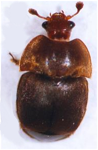
(Figure 2
shows a
reference map
and a photo of
an adult small
hive beetle).
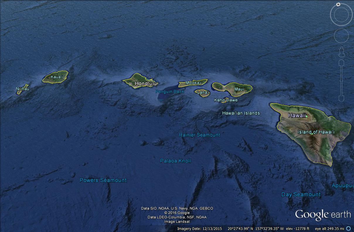
Figure 2.
Hawaiian Islands,
reference map.
Adult small
hive beetle (source:
USDA link).
|
In
addition, we begin
to supplement
that field
information
with mapped
information
from
others.
Information
from online
sources can
help to create
a base map for
future global
animation and
for the
insertion of
regional
datasets as
they become
available.
To
align the
mapping
decisions with
the data
decisions,
whether at the
local or
global scale,
we choose
to map the
data
regionally in
Google Earth
and offer the
associated
.kmz file to
readers to download,
while at the
same time
presenting
them with
animated .gifs
at varying geographical
scales,
so they can
access the main
content solely
within a browser.
As we
move forward
over time, we
expect visualization
software to
change, but we
hope
that the
mapping
strategy,
combining ease
of reading
with availability
of
contemporary
visualization,
is
sufficiently
general and
conceptual to
transcend the
inevitable
technological
changes that
will come
along.
Focus
on Hawaii--Animaps from
Field Information
In early 2016,
Sammataro met with colleagues in
Hawaii. Following initial
contacts, emails provided needed
information.
From
Sammataro to Rusert et al.:
"Here is the map of varroa spread. I
want to update the countries, and
noted that the different islands got
varroa at different times... If you
could correct that (send me dates
and which islands were affected) I
will put that on.
Here is the map
as it is now... I am also hearing
from Maryann that Africa needs
updating too...
My next project
is to do the same for SHBeetle with
possible soils info too, so any help
you can give on that would be
wonderful..."
Response to Sammataro from
Rusert: "Varroa was detected
on Oahu, April 2007 and on Big
Island, August 2008. It is
widespread on both of those islands
and has yet to be seen on Maui,
Kauai, Molokai, and Lanai. Small hive beetle is
widespread on all the islands and
was detected at the dates below.
Big
Island: April, 2010
Oahu: Nov,
2010
Molokai: May,
2011
Maui: July,
2011
Kauai: June,
2012
Lanai: February,
2013
I'm not sure of
the soil types, but can look into
it."
Sammataro then
forwarded the email to
Arlinghaus who created an
animated map from it (Figure
3). Custom icons were
created to suggest the honeybee
connection; time spacing between
successive animation frames
matches actual observation gaps
(as in the 1998 animap and
subsequent variations).
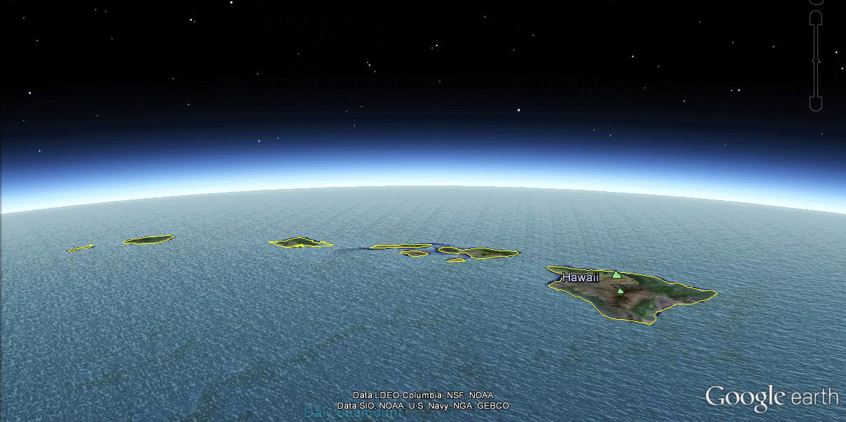
Figure 3.
Animated map of small
hive beetle in the
Hawaiian Islands.
Timing between
successive animation
frames corresponds to
timing in the underlying
dataset.
|
We
show the steps in data
acquisition here to
indicate how much detail
and work goes on behind
the scenes of a single
animated map. Here
we focus on the
initiation of the small
hive beetle series of
animaps. Readers of Solstice
can look
forward to seeing
updates of these and of
varroa maps, also
mentioned in the emails,
in future editions of Solstice
as more datasets arrive.
Online
sources
If one
searches the Internet for
maps and datasets
involving small hive
beetles, a number of
interesting maps and
related
materials will come
up. We show a
few here, as they
relate to our broader
desire to make
animated maps.
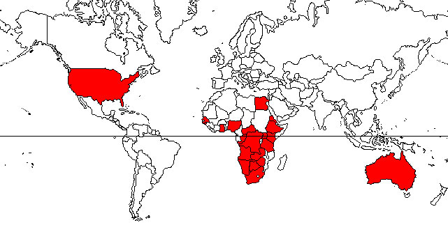
The
University of
Florida has a nice
site that includes
a map of the
global
distribution of
the small hive
beetle, by
country, as of
2010. It is
a static map that
is a useful
reference; it
is shown here in
Figure 4a.
We
envision a
global
animated map
based on a
static map of
this sort, made
on an equal area
projection (the
one in
Figure 4a is
not) that
brings in the
countries by
date, with
associated
colored
leading edge,
much as was
done in the
1998 varroa
mite
map. In
Figure 4b, we
see a move to
local mapping,
using
the power of
GIS software
(from
the Ontario
Ministry of
Agriculture,
Food and Rural
Affairs).
We envision
regional maps
such as these
coming to life
with
datasets
accumulated
over
time. A
number of
attractive and
useful
regional maps
are available
on the
Internet;
this
particular one
attracted our
attention
because there
are
dates already
associated
with polygons
so that one
might imagine
an animation
coming to life
simply from
this map
alone.
The reader is
invited to try
it; as it
there
are many more
steps
with the
datasets
behind an
animated map
than one might
imagine, so
too there are
many more
mapping
steps.
The animated
map is a
powerful, yet
elegant, tool
because it
compresses
large amounts
of data into
an apparently
simple
display.
Figure 4a. Small
hive beetle
distribution as of
2010 (Ellis and
Ellis).
|
Figure
4b. 2011 Ontario
Provincial
Apiarist
Annual Report.
|
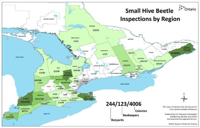
The
Invasive Species Compendium
has a number of useful maps
and datasets. One of
the maps available for
download is a .kml file for
Google Earth. When we
downloaded that file, it did
not, at least from that
particular download, display
reasonably in a current
version of Google
Earth. The .csv file
available for download,
did however appear quite
well in Microsoft Excel
(Figure 5). We look
forward to the day when
there is a single central
source for all such data
with regional datasets
from around the world
included in a single
file, as well as
separated files, so
that analysis and
mapping can become
more
straightforward.
Certainly
the work of this
Compendium seems
a fine start
in that
direction!
Figure
5. Dataset
from the Invasive
Species
Compendium.
|
Combining
the Global and the Local
To offer a
suggestion of our vision
for the future, we have
mapped the dataset in
Figure 5, using only
columns of complete
data, in Google
Earth. We used the
same placemark icon for
each
entry in the
spreadsheet as we
used for our
animated map of the
field study data for
Hawaii. Thus,
we were
able to
seamlessly, in
terms of icon
representation,
integrate datasets
at the regional
and global
scales.
Figure 6 shows an
animated versions of
screenshots
of this combined
file: local
Hawaii with global
data from the
Invasive Species
Compendium.
As such
spreadsheets fill
in with data, and
as more local
datasets become
incorporated, our
map will continue
to grow and visual
transitions will
become smoother as
dated material
becomes
widespread!
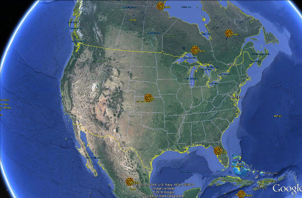
Figure
6. Animated
map based on both
Hawaiian
Islands field
study data and
mapped data from
the Invasive
Species
Compendium--local
and global scales
are unified in
this
animap.
|
Download
the kml file, from which
this animated map is
created, and add to it
yourself!
References
Arlinghaus, Sandra L.; Drake, William
D.; and, Nystuen, John
D. with data and other
input from Audra Laug,Kris
S. Oswalt, and Diana
Sammataro. 1998.
Animaps.
Solstice: An
Electronic Journal of
Geography and Mathematics.
Volume IX, Number 1.
Ann Arbor: Institute of
Mathematical Geography, http://www.imagenet.org
Arlinghaus, Sandra L. and
Sammataro, Diana.
2009. Bee
Ranges and Almond Orchard
Locations:
Contemporary Visualization.
Solstice:
An Electronic
Journal of Geography
and Mathematics.
Volume XX,
Number 1.
Ann Arbor:
Institute of
Mathematical Geography,
http://www.imagenet.org
Ellis
James D. and
Ellis,
Amanda.
2010.
'Featured
Creatures', University
of Florida,
Entomology
&
Nematology
http://entnemdept.ufl.edu/creatures/misc/bees/small_hive_beetle.htm
Hess, Darrell.
2016. McKnight's
Physical Geography: A
Landscape Appreciation,
12th Edition. Pearson
Publishing.
Invasive
Species
Compendium.
2012. http://www.cabi.org/isc/datasheet/109537
Larimore, Ann (with Sandra
Arlinghaus and
Robert Haug)
GEOMAT: Geographic
Events Ordering:
Maps, Archives,
Timelines. An
Historical-Geographical
Method for Aiding Conflict
Resolution. University
of Michigan
Course, 2005, 2007,
2008.
Ontario Provincial
Apiarist Annual
Report.
2011. Ontario
Ministry of
Agriculture, Food and
Rural Affairs.
http://www.omafra.gov.on.ca/english/food/inspection/bees/11rep.htm
Rusert, Lauren M. Personal
communication to Sammataro
Sammataro, Diana.
2001. Update
from Diana Sammataro:
Varroa Mite Animated Map.
Solstice:
An Electronic Journal of
Geography and Mathematics.
Volume XII,
Number 1. Ann
Arbor: Institute of
Mathematical Geography, http://www.imagenet.org
Sammataro,
Diana. 2006. Update
on the Varroa Mite Map.
Solstice: An
Electronic Journal of
Geography and Mathematics.
Volume XVII, Number 2.
Ann Arbor: Institute of
Mathematical Geography, http://www.imagenet.org
Sammataro,
Diana. 2007. Update
on the Varroa Mite Map.
Solstice:
An Electronic Journal of
Geography and Mathematics.
Volume XVIII,
Number 1. Ann
Arbor: Institute of
Mathematical Geography, http://www.imagenet.org
Sammataro,
Diana, and Arlinghaus, Sandra
L. 2010. The
Quest to Save
Honey: Tracking
Bee Pests Using Mobile
Technology.
Solstice: An
Electronic Journal of
Geography and Mathematics.
Volume XXI,
Number 2.
Ann Arbor: Institute of
Mathematical Geography, http://www.imagenet.org
Sammataro,
Diana. 2011. Varroa
Mite Project.
Note in Solstice:
An Electronic Journal of
Geography and Mathematics.
Volume XXII,
Number 2.
Ann Arbor: Institute of
Mathematical Geography, http://www.imagenet.org
Sammataro,
Diana. 2012. Update
on Varroa Mite Spread.
Solstice:
An Electronic
Journal of
Geography and
Mathematics.
Volume XXII,
Number 2.
Ann Arbor:
Institute of
Mathematical
Geography, http://www.imagenet.org
United
States
Department of
Agriculture,
Agricultural
Research
Service. http://www.ars.usda.gov/Research/docs.htm?docid=18993
|
In the In
|
|